Five website mistakes that drive your customers away - Part II

As an internet marketing agency in Toronto, we see simple mistakes that can drive away customers from client websites. It’s not that we are looking for them, they just seem to jump out at us.

In October 2012, we posted Five website mistakes that drive your customers away. Six months later, we decided to post PartII to illustrate another 5 common web mistakes that will potentially drive away your customers.  So, here is our second 5-point checklist  to help you give your visitors what they really want when they come to your  website.
[Read more...]

What colour is your website? Choosing the right colours can make a difference

In the online world, design is everything and your looks mean something. The first thing a user notices about a website are its colours, layout, and elements like logos and fonts. All of these design principles set a tone for the website and its function and user judgement is almost instantaneous.

While you may be, understandably, focused on your content and social media strategy, it can be easy to let some design and colour scheme flaws slip under the radar. Now it’s time to pay special attention to the colours you are using and ask yourself if they’re conveying your desired message.

[Read more...]

Internet Marketing Tips: Your Homepage is Where the Heart is

Most Important Aspects of A Web Site DesignToday’s post is by guest blogger, Al Biedrzycki. Al works at HubSpot as a consultant for the company’s partner agencies (like us).  He’s a Boston native and a graduate of Bentley University, the Waltham-based business school from which he acquired a degree in Marketing. Read Al’s full bio or follow him on Twitter. 

Let’s pretend for a moment that your website’s homepage is your house. This exercise is actually quite easy—you can start to draw quite a few comparisons without much effort. Think about it—you may have bought your house in the last decade. Perhaps you felt ambitious and built it yourself (if so, nice job). Maybe it’s had some work done (and in hindsight, perhaps the “improvements” are questionable). Seeing the connection? Cool.

[Read more...]

Re-designing your Web site: have you covered your assets?

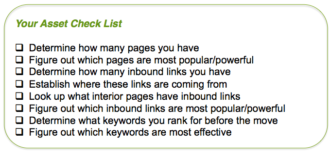
What is most important when you are considering a website redesign? Is it aesthetics? Navigation? New features? Before all of these, you need to consider Internet marketing and optimization. You need to cover your assets:

[Read more...]

Is it time for a Web site redesign?

You look at your website and start thinking it’s not quite what it should be.  You want it to be more eye-catching, more dynamic, and you want it to present your business in a whole new way, especially in this still-wild world of Internet marketing.

There’s nothing wrong with wanting to redesign your website, as long as you have a good reason why you want to do it.

Web Site Re-design Half-Life

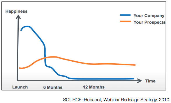
In some ways, a website redesign is harder than designing it the first time.  Users are accustomed to your current site and might have trouble adjusting to the new one.  If they can’t figure it out right away, they may get so frustrated that they abandon the site for good.  That’s why you need to redesign your site for the right reasons.

Here are some bad reasons for doing it:

[Read more...]

Laredo Law Web Site design and development

Laredo Law Home Page

Click to Visit

Project Summary

This midtown law firm approached Fruition to create a site that was clean-looking and that didn’t look and sound like every other law firm on the planet.

Lots of white space as well as visuals and copy designed to connect with the hearts and minds of prospective clients help Laredo Law stand out from the crowd.
[Read more...]

Featured Client: Catalyst Learning Group

When Catalyst Learning Group wanted to launch a new online business they turned to Fruition to make it happen. Visitors to Catalyst’s new site can now register and access its complete e-learning course library in just a few clicks, allowing the client to expand its reach to a global market, while a new  visual identity better reflects the client’s brand and value.

[Read more...]

3 ways to get more value out of your Web site @ BNI Bay Street

I’m going to be doing a presentation next Wednesday, January 26 on “3 Ways to Get More Value out of Your Web site” as part of BNI Bay Street’s regular weekly networking group.

The 10 minute briefing will cover the 3 core principles that will help businesses get more leads, sales, opt-in’s and other business value out of their Web site.  There’ll be a brief Q+A  to follow.

In addition to the presentation, you’ll have a chance to expand your network by meeting with a couple dozen of the city’s brightest small business people.

BNI Bay Street meets at the Strathcona Hotel, 60 York St., Toronto from 12:30 p.m. to 2:00 p.m. every Wednesday. The cost is $25 and includes a  lunch (it’s good food, too). Dress is business attire (so no jeans or runners, please).

If you’re interested in coming, please RSVP to me at [email protected].

15 Ways To Increase Your Conversion Online

Recently, I wrote an article called Is Your Website Converting Leads into Gold? In it, I discussed the importance of optimizing your website or landing page for lead conversion.

With that in mind, here are 15 additional ways to increase your conversion online:

1. Keep your most important sales elements “above the fold” (ideally on your home page, without scrolling). This usually means putting your most interesting content with a convincing call-to-action and perhaps even a photo of you (to build trust and rapport). Tip: Tools like CrazyEgg can help reveal your most important content that should be at the top left side of your page.

2. Are you using a standard and up-to-date web design or blog theme? Navigation should be immediately understandable. Is there a lot of distracting navigation leading your customers away?  Remove it.

3. Let prospects know they’re buying from a human being. Keep the copy personal, friendly, and (for most markets) informal. Sound like a person, not a robot.

4. Simplify your content.

5. Do your headline and subheads tell an intriguing story if you read them without any of the rest of the copy?

6. Make the first paragraph easy to read.

7. What’s the experience of using your service? Could you make that more vivid with a testimonial video or a great case study? (we’re currently in the process of doing this for ourselves)

8. Got testimonials? Use them.

9. Is your message confusing? Can a bright ten-year old read your sales copy and figure out why they should use your service.  You might be an expert in your industry, but your prospects aren’t.

10. How often are you using the word “You”? Can it be increased?

11. Have you made yourself an authority in your market?

12. Throw in some more proof that what you’re saying is true. Proof can come from statistics, testimonials, case studies, even news stories or current events that illustrate the ideas your product or service is based on.

13. If you demand a pretty penny for your services make sure your web design and content is congruent?  If your average client brings in $15,000 annually, make sure you own your own domain and its not a site your nephew built (unless they’re really that good).

14. Cut all long paragraphs into shorter ones. Make sure there are enough subheads so you have at least one per screen. If copy looks daunting to read, it doesn’t get read.

15. Increase your font size.

Did I miss any?

About the Author:

Mitch Fanning is VP of Strategy & Business Development for Fruition Interactive (Toronto, Canada), a professional member of Social Media Club, and founding member of Social Media Club Niagara. He’s spent 10 plus years working with businesses of all sizes, from global brands – to mid-sized B2B companies – to some of Canada’s fastest growing Internet start-ups ranked in the PROFIT 100. Follow Mitch on his adventures in new media at [mitchellfanning.com].

Did you like this article?  Check out additional articles on optimizing conversion here.

Why you NEED to be using rich media online

When I first started working in interactive media — over 15 years ago now — the Web was all about text. Sure, there have always been images on the Web and video’s been around for a long time, too — I produced a live video Webcast back in 1996, even. But that stuff was hard and had kind of a lousy user experience — dial-up Internet speeds made image and video downloads painfully slow, software for audio and video required special software that was often buggy or that installed all kinds of spyware and other stuff you didn’t want on your computer.

Those days are long gone now, though. Audio and video online are easy now — nearly 70% of all adults online have watched a video online and nearly 20% of them watch video online every day.

And, what’s more,  online video is becoming key in helping businesses connect with their customers and potential customers. There’s a growing body of research  that video online drives a number of important business results, including awareness, engagement and actual conversions.

[Read more...]