Elevate your Internet marketing with 3 simple landing page tweaks

In a previous blog post, we discussed conversion optimization tweaks to the offer and copy on your landing page. In this post, we will focus on the landing page itself.

As part of your Internet marketing repertoire, your landing page plays a crucial role.

[Read more…]

Five website mistakes that drive your customers away - Part II

As an internet marketing agency in Toronto, we see simple mistakes that can drive away customers from client websites. It’s not that we are looking for them, they just seem to jump out at us.

In October 2012, we posted Five website mistakes that drive your customers away. Six months later, we decided to post PartII to illustrate another 5 common web mistakes that will potentially drive away your customers.  So, here is our second 5-point checklist  to help you give your visitors what they really want when they come to your  website.

[Read more…]

What colour is your website? Choosing the right colours can make a difference

In the online world, design is everything and your looks mean something. The first thing a user notices about a website are its colours, layout, and elements like logos and fonts. All of these design principles set a tone for the website and its function and user judgement is almost instantaneous.

While you may be, understandably, focused on your content and social media strategy, it can be easy to let some design and colour scheme flaws slip under the radar. Now it’s time to pay special attention to the colours you are using and ask yourself if they’re conveying your desired message.

[Read more…]

Five website mistakes that drive your customers away

Websites are an integral part of business today. However, a poorly planned website can actually do more harm than good for your brand. A website that is an exercise in frustration to go through is likely to discourage visits, disillusion customers with your brand, and of course, hurt your bottom line.

But these pitfalls can easily be avoided.


Here are five of the most common website mistakes that create poor user experience and drive your customers away. [Read more…]

Testing 1, 2, 3: the forgotten key to your Internet marketing success

Testing is the hidden key to your Internet marketing success

I’ve worked on a lot of online marketing initiatives over the past decade or so, working with everyone from 1-person law firms, to big marketing agencies, to some of Canada’s largest corporations. And many have been very successful. But even the most successful campaigns could have been better.

Here’s where I see marketers and agencies missing a huge opportunity for better results from their Internet marketing.

[Read more…]

Do you know what your visitors see when they come to your site?

New predictive models bring advanced online marketing research within reach of small and mid-sized businesses

Eye Tracking Heat Map Example

Do you know what your site visitors see when they come to your site?

Unless you’re a marketer with a Fortune 500 company with an Internet marketing research budget of thousands or tens of thousands of dollars for user experience research, chances are the answer is “no.”

Without a huge budget for research, small and mid-sized businesses used to have to rely largely on educated guesswork and, potentially, months’ worth of A/B testing in the real world to optimize their Web site’s ability to generate leads.

But now Fruition can help you start to optimize your site pages, with evidence-based research, before your site has even launched. And at a price – this is the game-changing part – that small and mid-sized businesses can afford.

Here’s the deal.

[Read more…]

7 Rules to Designing a Call to Action that Converts

Last time, I wrote about the importance of having strong call to actions (CTAs) on your website.

When done correctly, CTAs can have an immediate impact when it comes to improving conversion rates on your website (something you want).

I realize for most of you, this is common sense, but when it comes to Internet marketing, I’m still surprised at how many websites lack the basics (like a strong call to action on the home page).

That said, designing and optimizing CTAs that convert is a both an art and a science.

It’s not easy, but if you’re serious about using Internet marketing to grow your business, there are some general rules you need to follow when designing a good CTA.

[Read more…]

Internet Marketing Tip: Original, Quality Content is Key

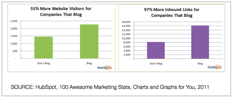
Graphs: Benefits of Blogging to Internet Marketing

There are numerous avenues of Internet marketing to venture into, and a plethora of tips and tricks you can apply in each to make the method of marketing more effective. One internet marketing tip, however, encompasses several facets of interactive and digital marketing, and is proven to be effective on several levels: original, quality content is key.

You probably heard it before, said in a different way or written in a different manner. Regardless of how it is said, the truth of it remains, and the advice is worth heeding. In fact, ensuring your website blog provides your visitors with fresh, original content is statistically proven to lead to success:

[Read more…]

Better Landing Pages = More Internet Marketing Success

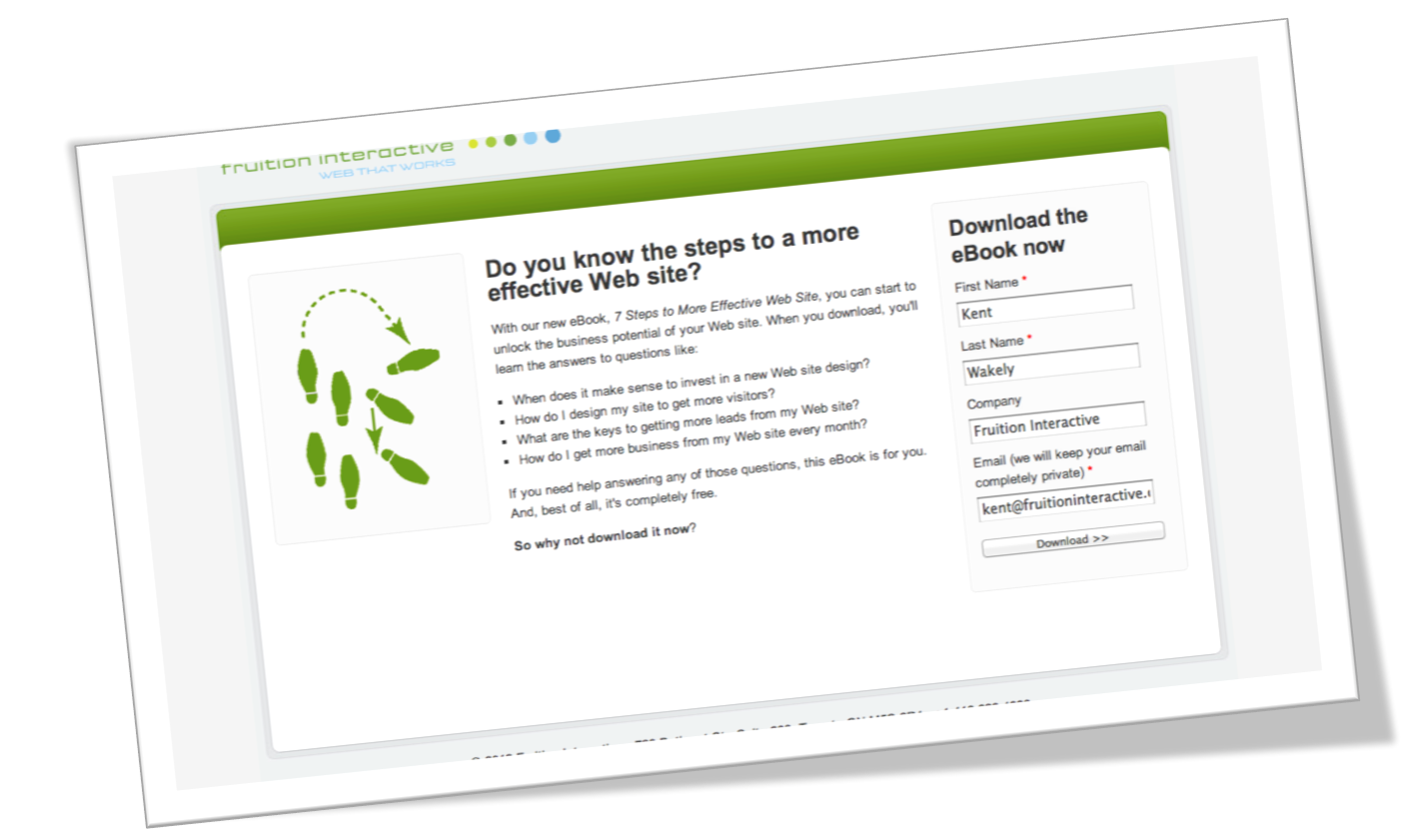
Sample Internet Marketing Landing Page

Over the course of the evolution of Internet marketing, a handful of marketing tools and methodologies have remained useful and effective. Through changing from predominantly interruption-driven efforts to black hat search optimization to inbound marketing and further on to social media, advertising efforts such as landing pages have been pillars of advertising campaigns and rightfully so: if designed correctly and given great market copy, landing pages are very effective in lead generation and lead info capture. often they are also used for direct conversion to sales as well, which means they can be used on both ends of the sales funnel.

Being so central to Internet marketing endeavors, it’s only natural that the better your landing pages perform, the more successful your campaigning becomes. So how do your landing pages fare?

[Read more…]

Internet Marketing Tips: Your Homepage is Where the Heart is

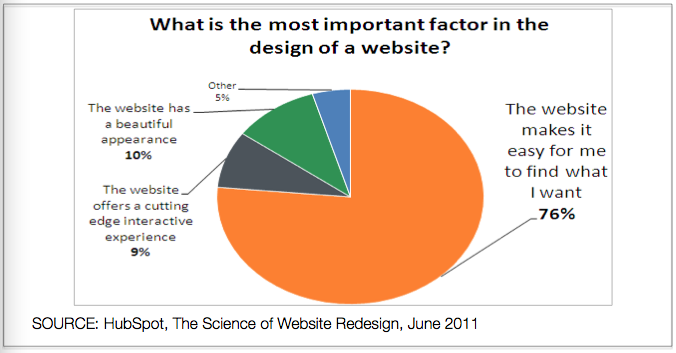
Most Important Aspects of A Web Site DesignToday’s post is by guest blogger, Al Biedrzycki. Al works at HubSpot as a consultant for the company’s partner agencies (like us).  He’s a Boston native and a graduate of Bentley University, the Waltham-based business school from which he acquired a degree in Marketing. Read Al’s full bio or follow him on Twitter. 

Let’s pretend for a moment that your website’s homepage is your house. This exercise is actually quite easy—you can start to draw quite a few comparisons without much effort. Think about it—you may have bought your house in the last decade. Perhaps you felt ambitious and built it yourself (if so, nice job). Maybe it’s had some work done (and in hindsight, perhaps the “improvements” are questionable). Seeing the connection? Cool.

[Read more…]