 Today’s post is by guest blogger, Al Biedrzycki. Al works at HubSpot as a consultant for the company’s partner agencies (like us). He’s a Boston native and a graduate of Bentley University, the Waltham-based business school from which he acquired a degree in Marketing. Read Al’s full bio or follow him on Twitter.
Let’s pretend for a moment that your website’s homepage is your house. This exercise is actually quite easy—you can start to draw quite a few comparisons without much effort. Think about it—you may have bought your house in the last decade. Perhaps you felt ambitious and built it yourself (if so, nice job). Maybe it’s had some work done (and in hindsight, perhaps the “improvements” are questionable). Seeing the connection? Cool.
Okay, now that we’ve successfully brainstormed some similarities between your homepage and your house, ask yourself the following questions about your home:
- Am I proud of it?
- Would I other folks over at any given moment? Or would I need to tidy up a bit?
- Does it need a new coat of paint?
- Would a guest be able to find the kitchen? The bathroom?
See where we’re going with this? House analogies aside, these are the same types of questions you should be asking when planning out your website’s homepage. Okay, you wouldn’t literally “paint” your homepage or include “bathroom” in the top navigation, but incorporating these types of ideas into the anatomy of your website will definitely help you improve its internet marketing effectiveness. How so, you ask? Here are the top attributes to consider:
A homepage should:
- Be functional:
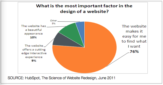
- This is definitely the most important attribute. Above everything else, you’ll want to make it easy for website visitors to find what they want. Clearly define what your products and/or services are in a layout that’s easy to understand and navigate. For example, if you have 25 products, don’t list them all on the homepage! Ensure that you’re organizing them under categories so it’s easier for a user to understand. You wouldn’t want to send a houseguest to several different rooms before disclosing where the bathroom is, right?
- Be aesthetically pleasing:
- Your homepage is essentially the face of your services or products. You only get one chance to make a first impression, so make sure it’s not wasted. Keep in mind though that while a homepage’s look is important, it should be a secondary attribute when determining your homepage’s anatomy. Sure, it’s good to have a pretty homepage, but functionality is superior, especially if the website’s goal is to help grow your business.
- Be the Launching Platform for engagement:
- Like the friend’s pad that hosts the best house-parties, a well-oiled homepage will serve as a place to keep your guests (i.e. website visitors) engaged. Implement the internet marketing equivalents of a man-cave, Jacuzzi, and pool table to your homepage. Examples are easy links to the blog, social media or an eNewsletter subscription form. These items will keep your visitors coming back for more and ensure you’re the coolest site on this side of the web.
Just like home sweet home, your website’s homepage should be a functional place for visitors to navigate. A homepage that is simple to traverse, easy on the eyes and engaging will provide visitors with an experience that provides purpose—which should be the ultimate goal of your website.

