So you’ve taken the plunge. You’ve invested your time, money or both in creating new traffic for your Web site. Maybe you’ve done some Search Engine Optimization on your site, started a Google Adwords campaign or been effective at using Twitter, LinkedIn or other social media to drive traffic to you and increase your visibility.
Now what?
What do you want all those new visitors to do?
If you’re in business you probably want those new visitors to become your customers (and if you’re a non-profit you want them to become your donors, your volunteers or your advocates). You want them to convert.
And the key to converting your visitors into customers is having a strong and effective Call To Action on your site.
What’s a Call To Action? It’s an invitation to your site’s visitors to take the next step towards becoming your customers (what that step is is going to depend on your business and your sales process).
So what makes a strong and effective Call To Action?
Visibility
Effective Calls to Action are highly visible. Nobody can act on your call if they can’t see it, right?
You’ll occasionally see companies that bury a Call to Action in an obscure part of their site or on a hard-to-see part of their site’s pages. But the far more common visibility crime is trying to pack too many Calls to Action into too little space. I’ve seen sites that have 7 or 8 calls to action all competing with each other for users’ attention. There’s so much clutter that users can’t focus on any of the key messages. The calls may as well not be there at all.
Clarity
People can’t act and won’t on your Call if they don’t understand it.
Make your offer simple and make the process for acting on it easy to understand. This is harder than it looks.
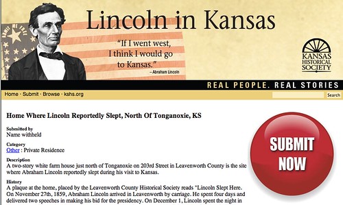
Take the screenshot above as an example. The message seems simple enough — “Submit Now”. But what is it exactly they want me to do? And would my wife approve? Oh, they want me to submit a thing… What kind of a thing?
Not surprisingly, the site hasn’t had many people, errrr… submit to them. In other words, they haven’t had many conversions.
Connection
To be effective, your call needs to connect with your site’s visitors. It needs to be relevant — you need to be offering something people want — but it needs to be more than that. It needs to appeal to the heart and the mind.
Take these two calls to action for exactly the same cause. Which one do you think is more effective?
This one:
Or this one:
The image of the family celebrating and the More Birthdays theme make the second Call to Action way more emotionally resonant and way more effective.
Urgency
I don’t think I’ve ever seen a “Buy Later” button on a Web site. And there’s a good reason why. As a great person once almost said, “commerce delayed is commerce denied.” Even if your visitors see your call, understand your call and resonate with your call there’s a good chance they won’t act on your call if they feel like they can put it off until later.
Limited time offers are great tools to create urgency so long as you’re not BS-ing your customers about the offer really being time-limited. But I’ve even seen the addition of the word “Now” to a call to action improve conversion rates by 5 to 10 percent.
Great calls to action are keys to great business results online. So make sure your site has one or two visible, clear, resonant and urgent Calls To Action… today.


Pingback: Tweets that mention Your Web site’s got traffic. Now what? « Fruition Interactive : toronto interactive strategy, web design and development, online marketing -- Topsy.com