At Fruition, we talk a lot about Web site usability and good online user experience. It’s kind of what we do around here. But as a business person, why should you care about whether your Web site is clean-looking and easy to navigate?
It’s about conversions
Increasing your site’s conversion rate is the easiest and most cost-effective way to generate new leads and new revenue from your site. Period. You don’t need to spend a dime on driving new traffic to your site to generate additional revenue if you can increase the number of your current visitors who become customers. And the payoffs can be huge.
Let’s take, for example, a site that gets 20,000 unique visitors in a month. There are a lot of sites that do this kind of traffic. If we can increase their conversion rate — the percentage of those visitors that become customers — by 1%, that’s 200 new customers a month.
What’s the lifetime value of a customer to your business? For a lot of our clients, that number is in the thousands or tens of thousands of dollars. And what would you spend to increase your sales by $200,000 a month?
So how does Web site usability factor into this math?
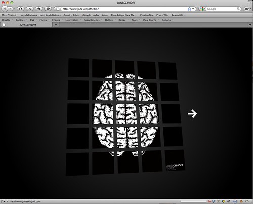
Well, clean design and clear navigation are prime determinants of your site’s conversion rate. Let’s take the site at the top of this page as an example. Visually, the design of this site is lovely — it’s clean enough, anyway. But, quick, tell me: what does this company do and how do I become their customer? (The answers, I think, are 1] product design, terrifyingly enough, and 2] I have no idea).
This site fails to communicate that basic information because its navigation is completely unclear. How exactly do you find ANY information on this site? How many of this site’s visitors could possibly be becoming clients? And how much would their conversion rate increase if they followed the example of their competitor (and heroes of mine), IDEO.
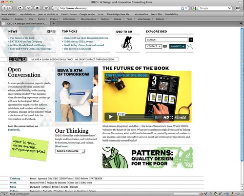
Here’s what IDEO’s site looks like:
It’s clean AND I can easily understand what they do, what their value proposition is and how I can get in touch with them to become their customer. I’m going to guess that joneschijoff would increase their conversion rate by a lot more than 1 percent if they followed that lead.
It’s about credibility
So good navigation matters. And it’s worth, potentially, a lot of money to your business. What about clean design?
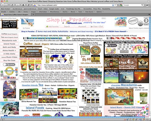
Let’s take this site, for example:
Let’s say, just for the sake of argument, that you could actually figure out how to buy something from this company. Would you?
Would you trust a company with such a disorganized Web site to handle your personal and credit information with due care? Would you trust them to have high quality, fresh products? Would you trust them to fulfill your order properly? Would you trust them to deal with any problems in a professional manner?
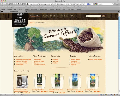
For all I know, they may do all of those things exceptionally well. My point is that their visually disorganized Website undermines that perception. You’re probably more likely just to click away and buy from these guys instead:


Pingback: Tweets that mention Why Web site usability matters « Fruition Interactive : toronto interactive strategy, web design and development, online marketing -- Topsy.com